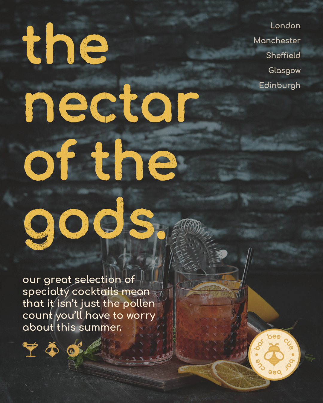
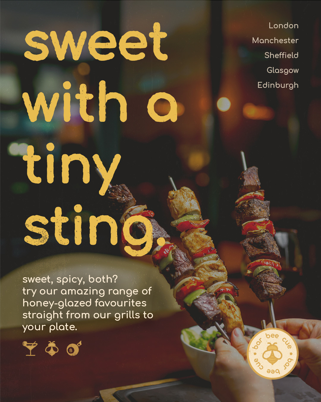
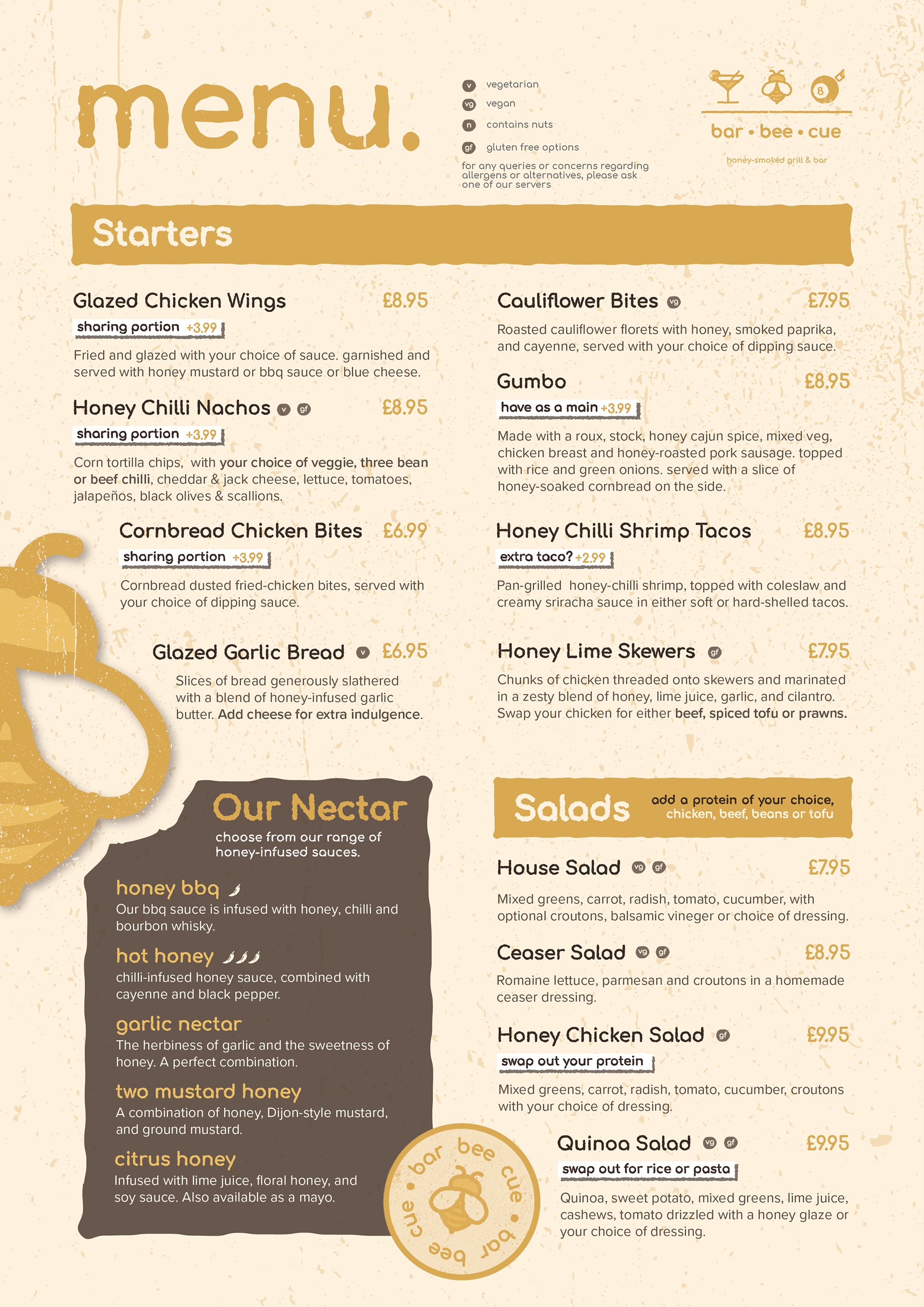
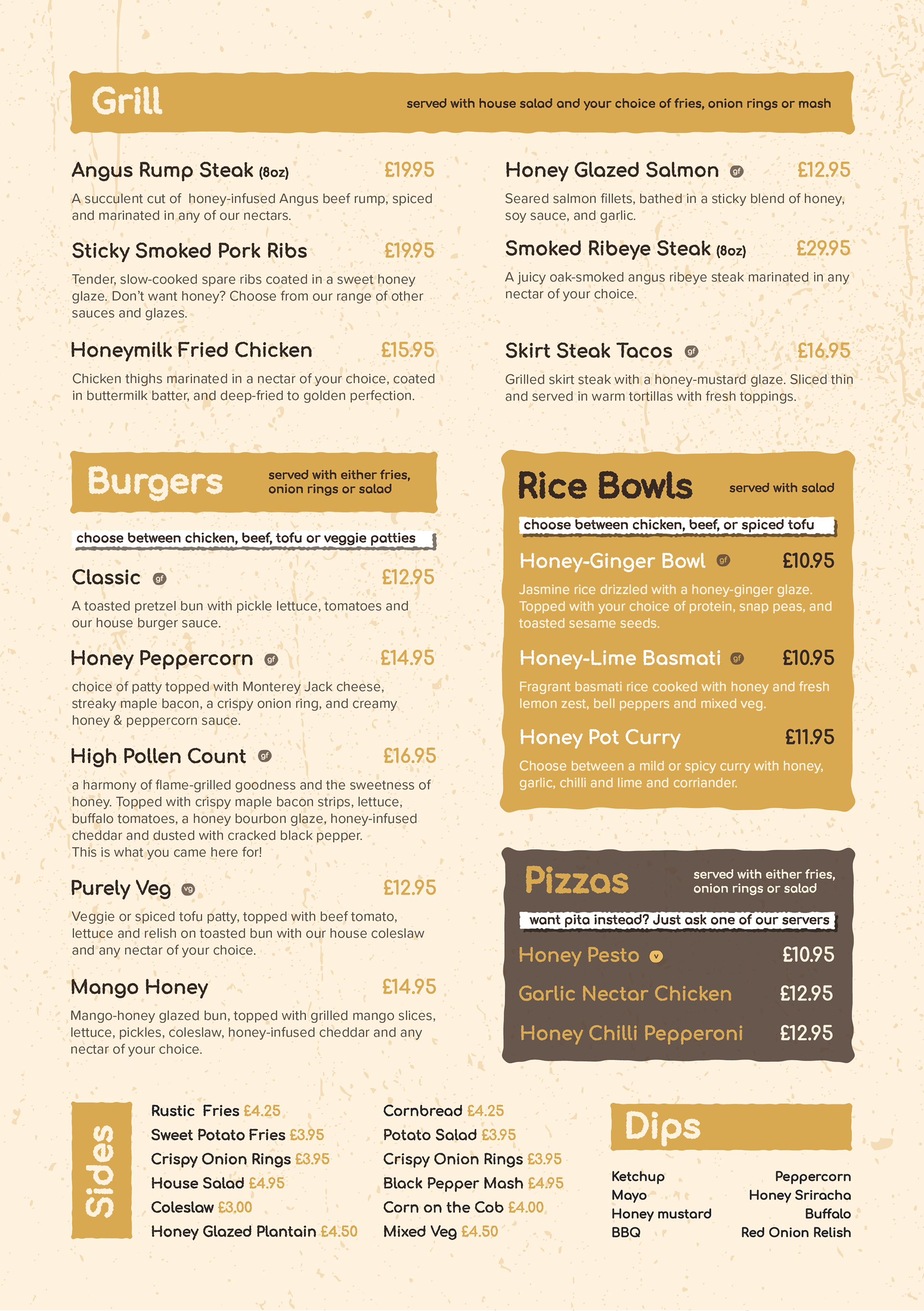
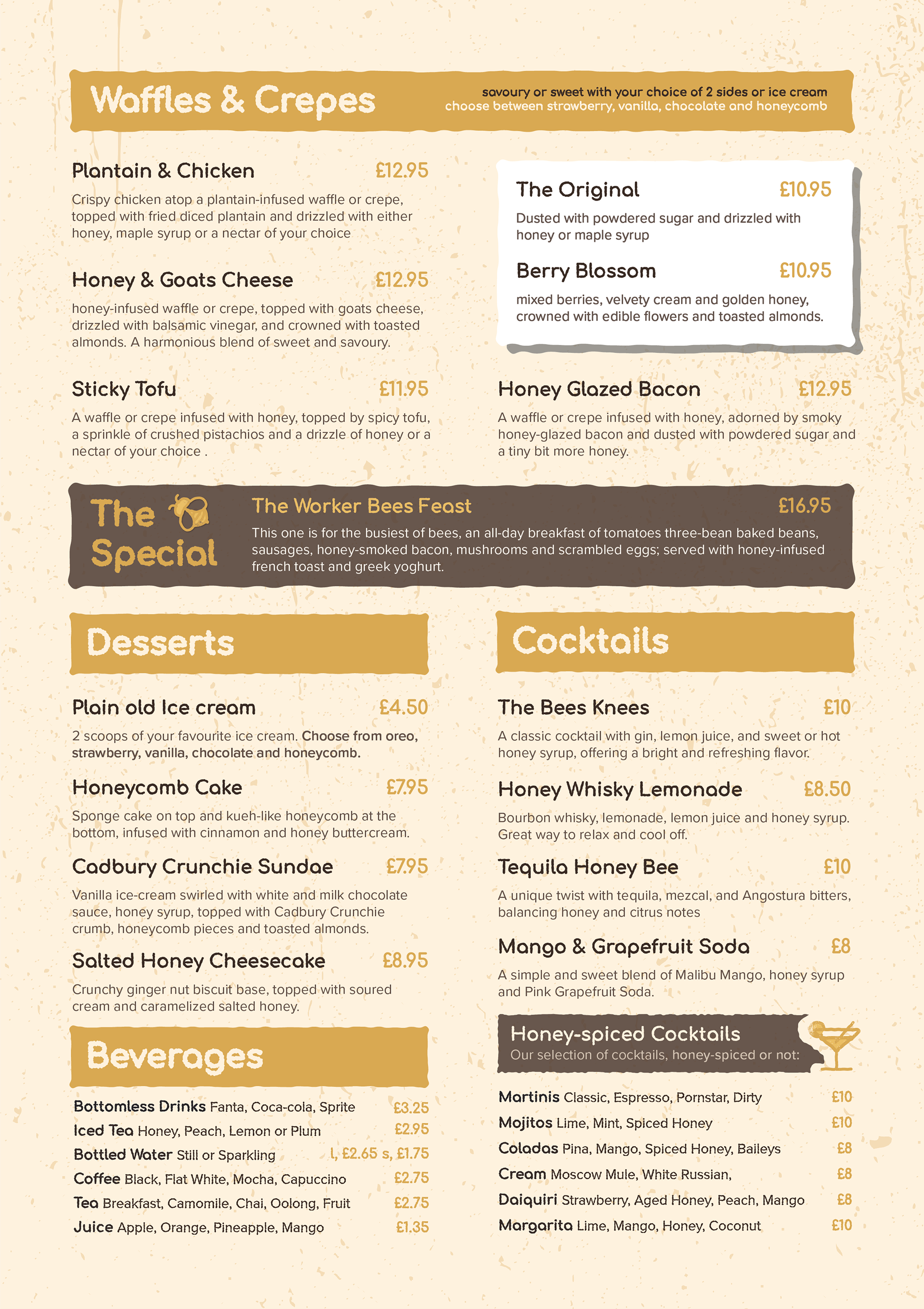
bar-bee-cue is a contemporary grill & bar, specialising in honey-glazed dishes, the chain has been defined by its open kitchen concept and arcade spaces.
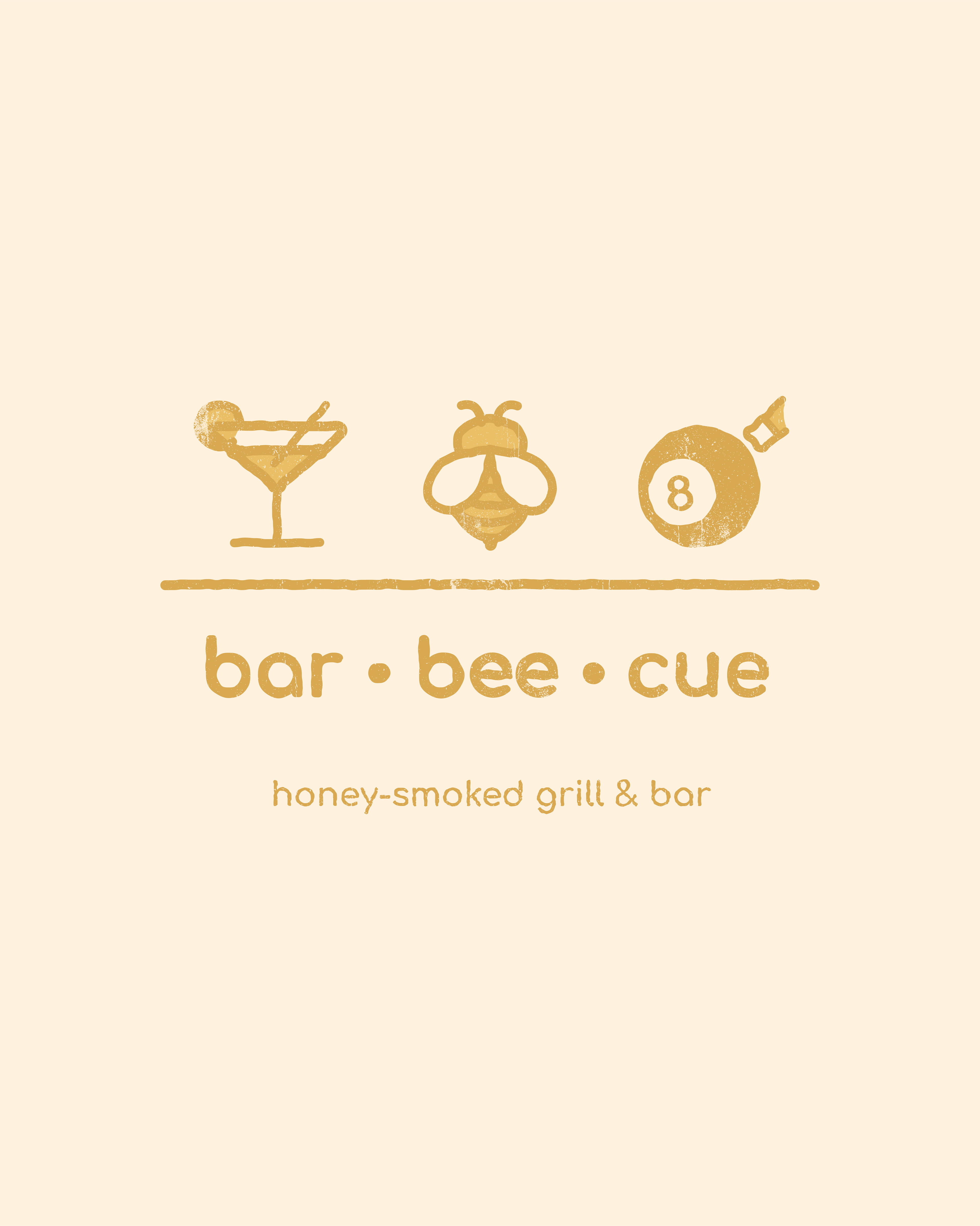
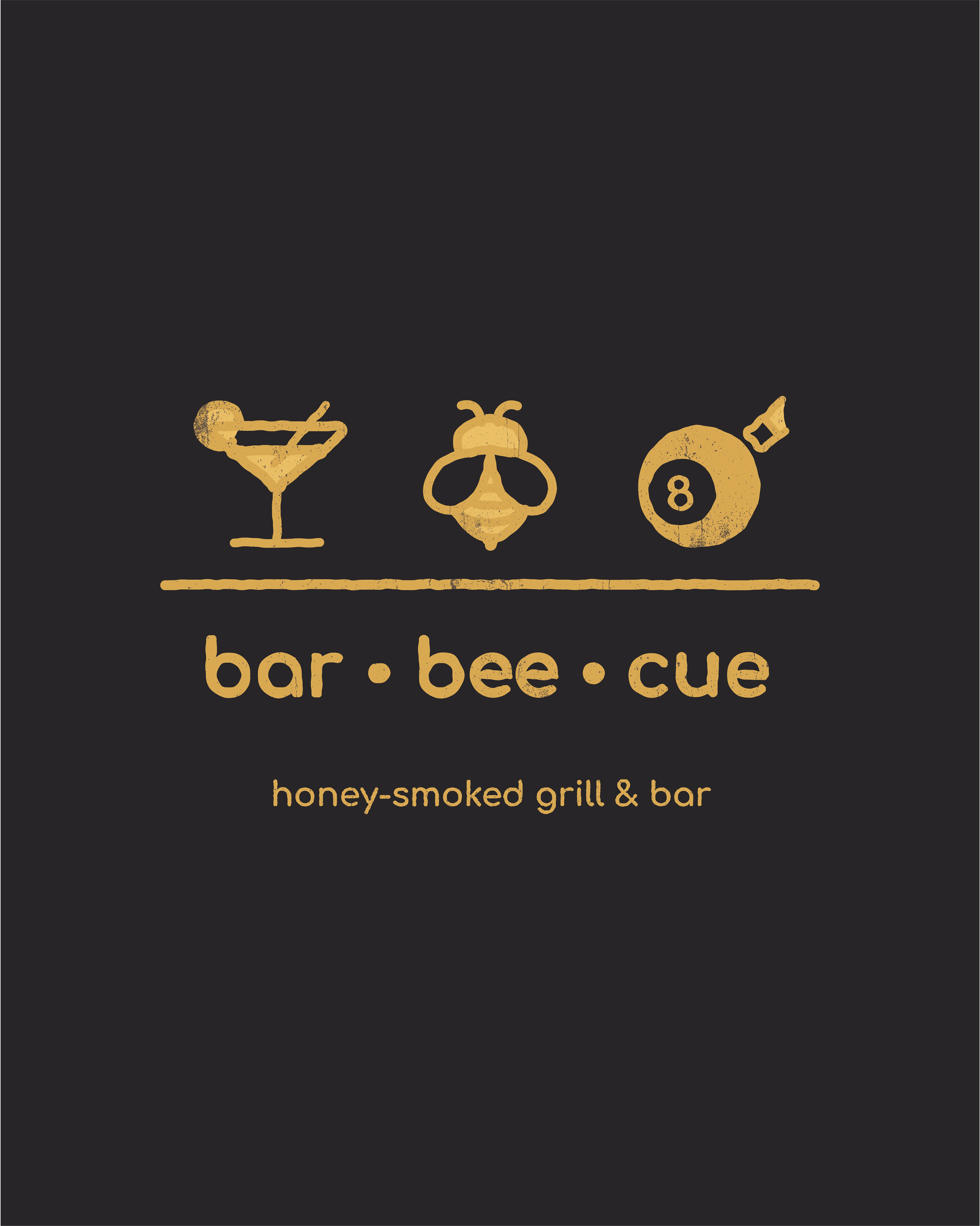
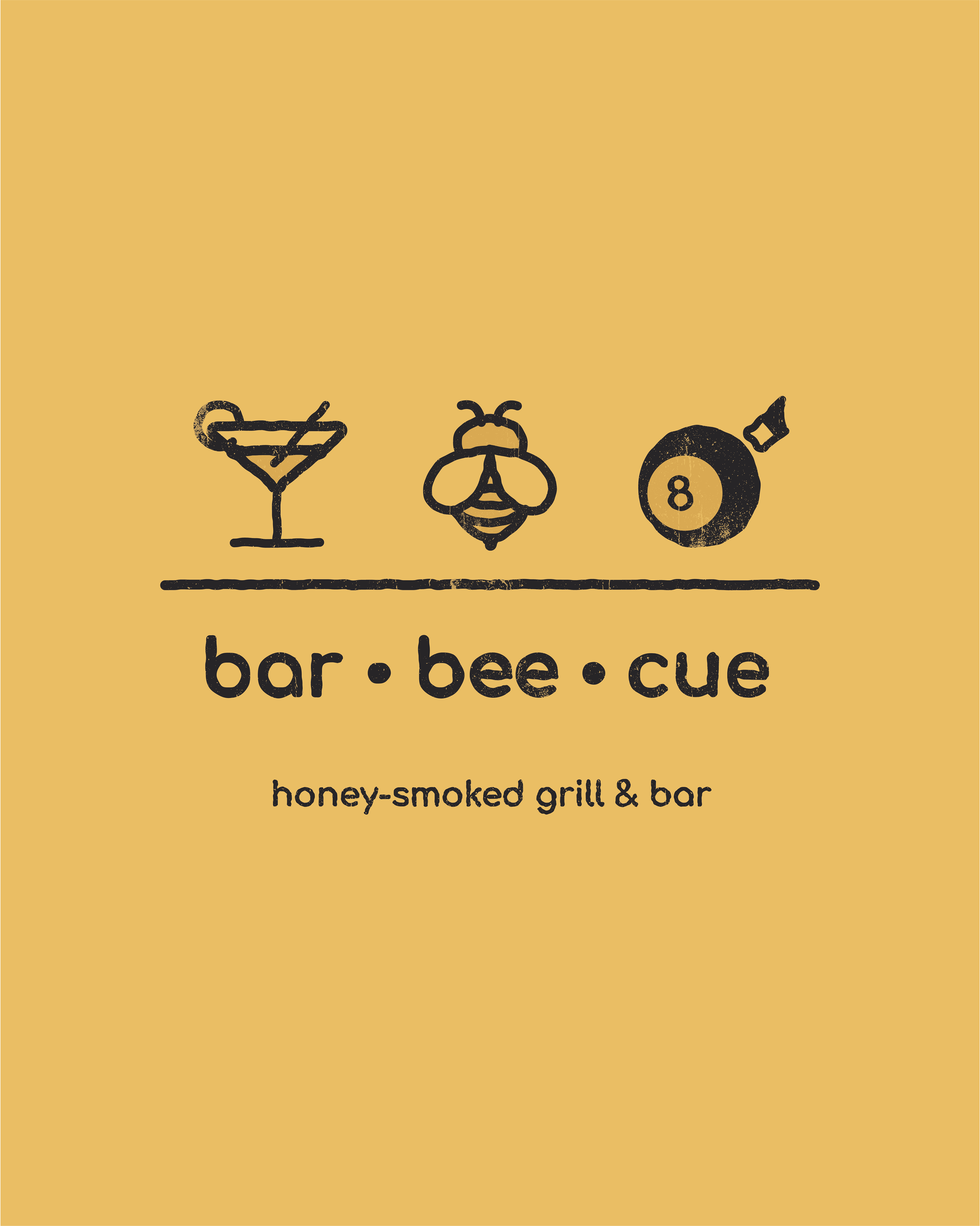
The logo concept was derived from the wordplay in the brand's name: bar-bee-cue.
The intention was for the logo to be both classy (using a horizontal layout and monochromatic colour scheme) and playful, with the playful nature being added through the iconography and type.
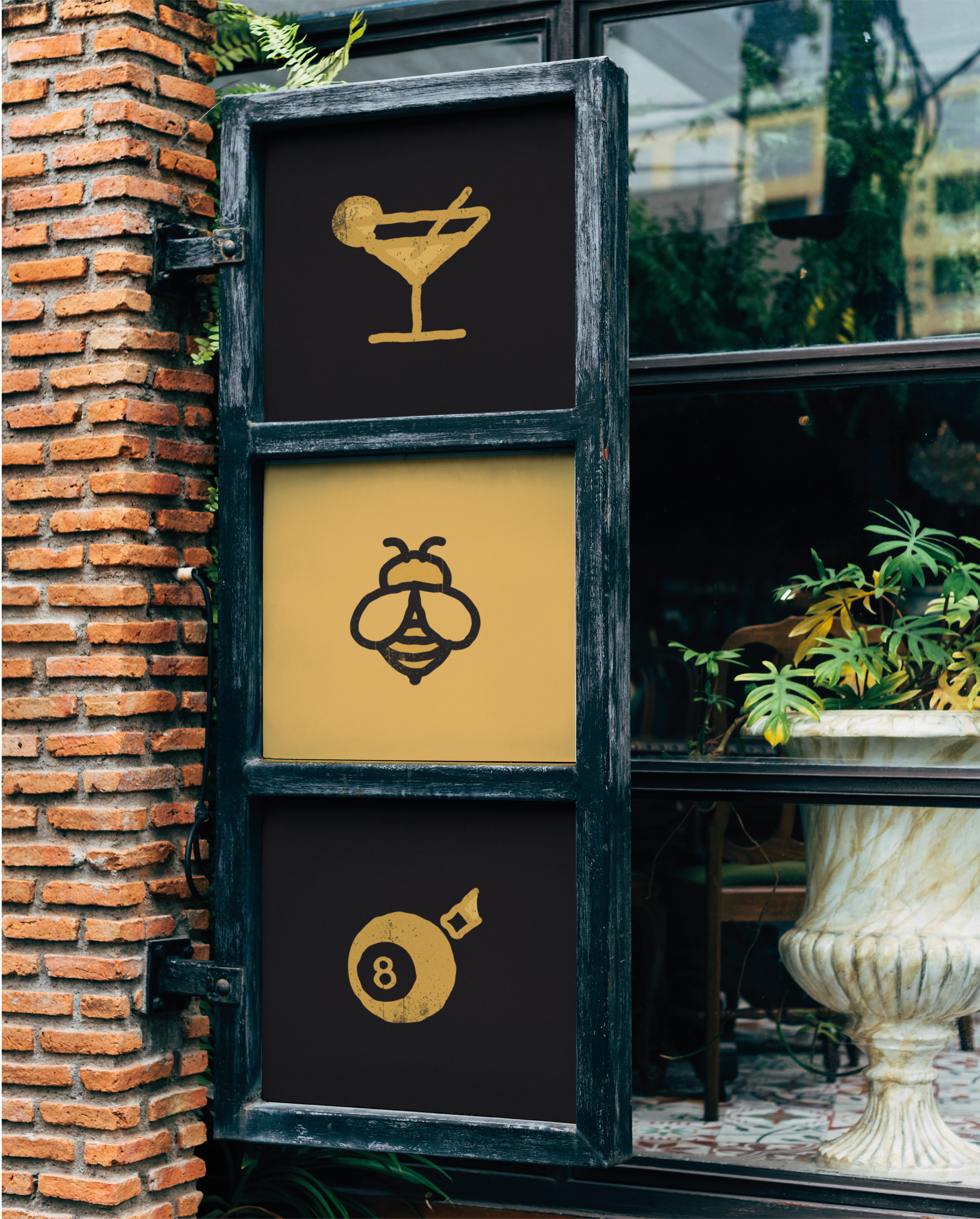
Icons were created based on each word (cocktail icon for bar, bee icon for bee and a billiards ball for cue) to form the pictorial marks. Both the pictorial mark and logotype are straggly with a rough texture harkening to the grill aspect and informal nature of the brand.
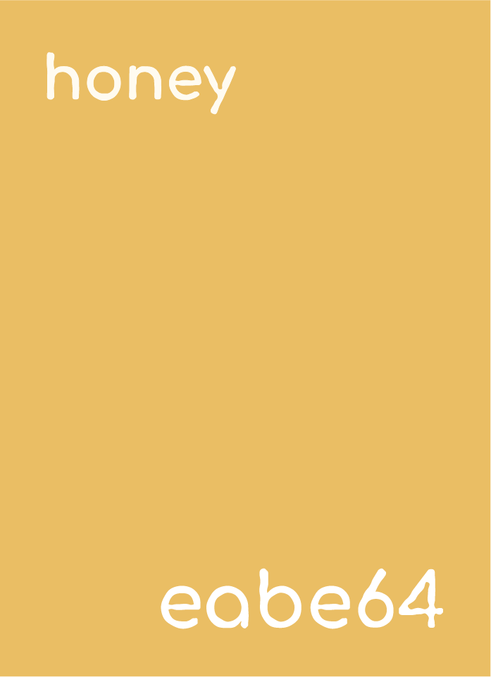
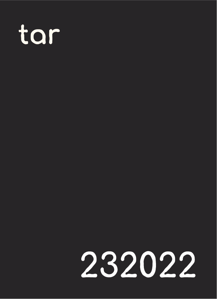
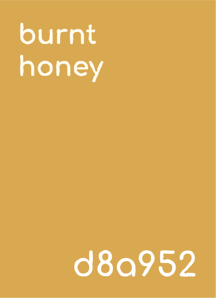
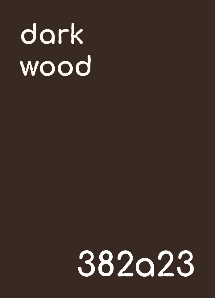
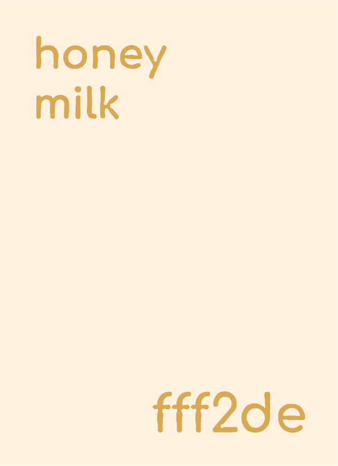
For the colour palette, a simple one was chosen with a mixture of monochromatic and complementary colours that matched the honey theme of the restaurant.
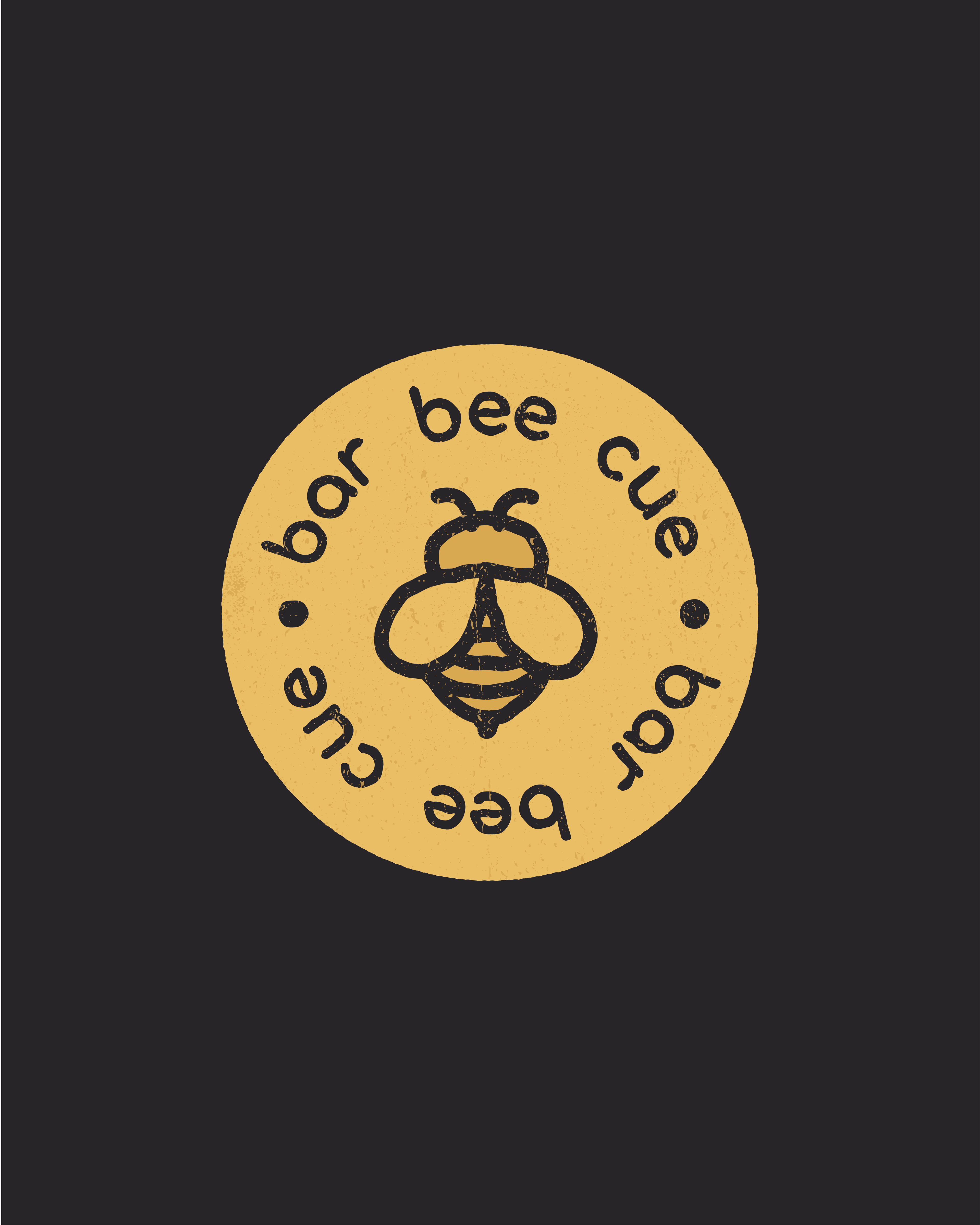
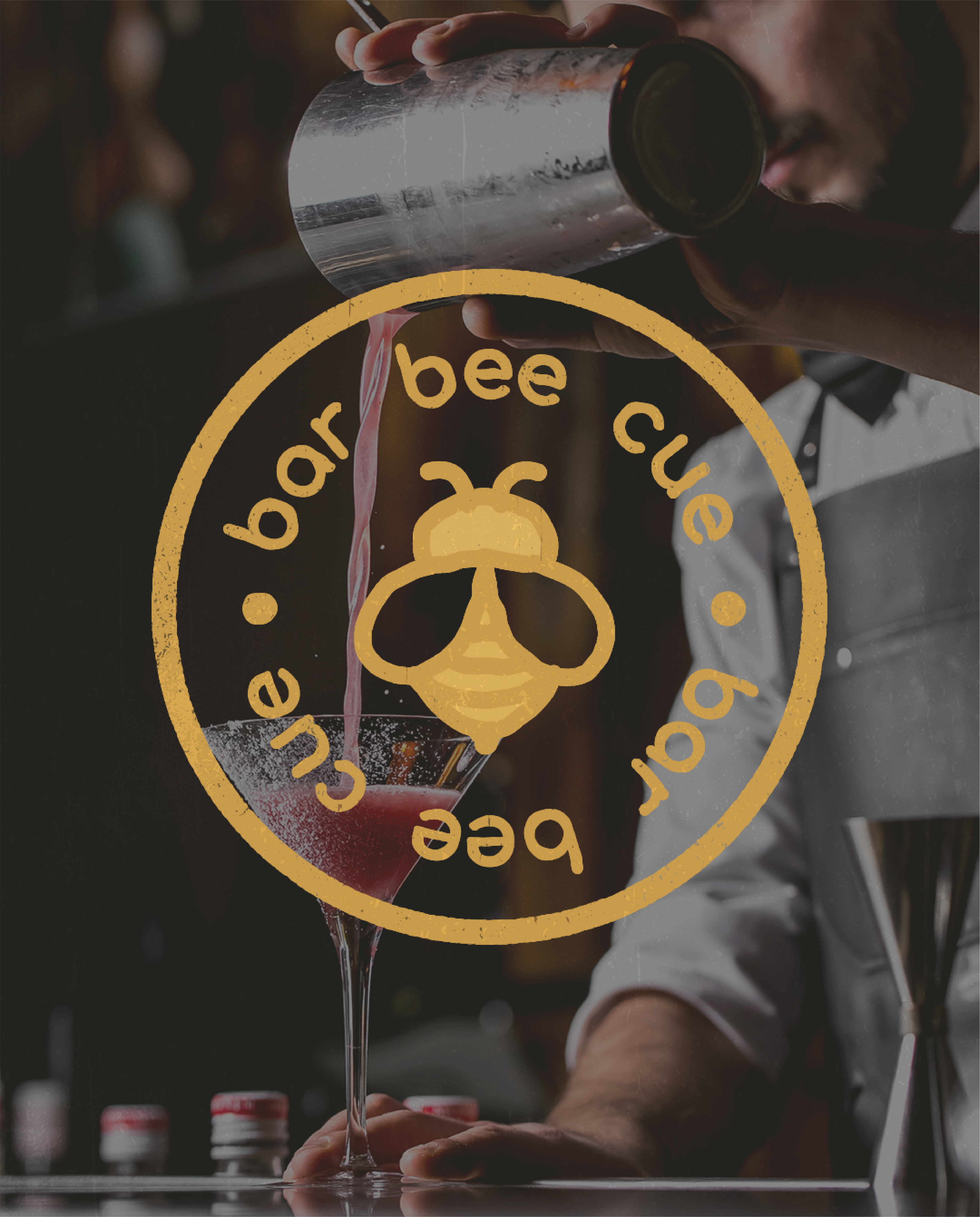
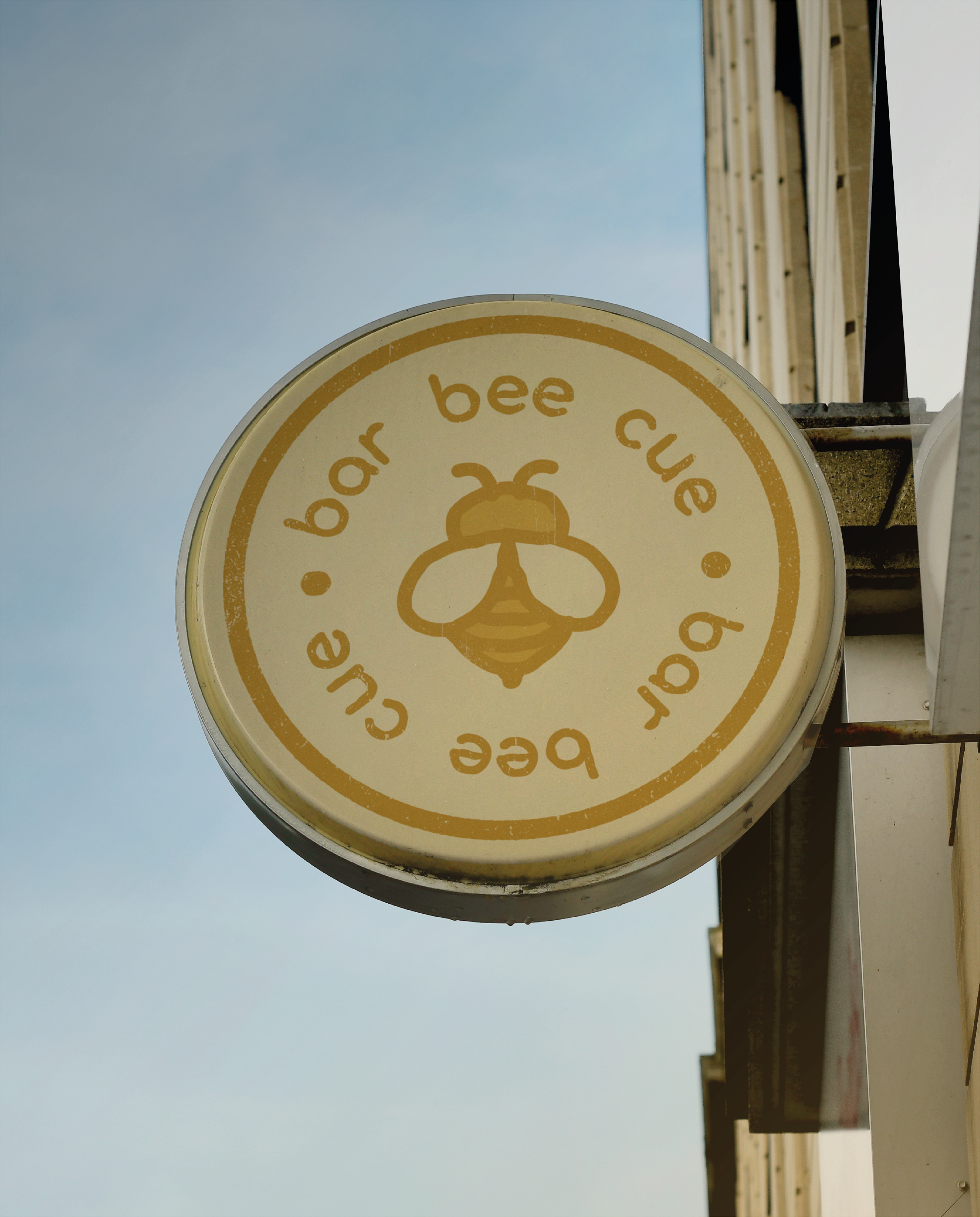
The badge logos are inspired by the retro and rustic stamp logos that are synonymous with grills, steakhouses and BBQs. The badge includes the bee icon, which will be the hero icon for the whole brand.
